A trip to Yorkshire episode 1: Salts Mill and David Hockney….

I said I was going to tell you my trip to Yorkshire  last weekend, as I am off camping next week in the wildness…( I do that once a year 😀 )  hence I will not be able to write much next week so I’m doing it today 😀  So two blogs entries in two days AGAIN!

I went to Yorkshire for a Blogstar’s meeting as you probably already know, and part of the weekend Stylecraft always organize something interesting to do that is craft/art related.

Last time we went to see the Knitting and crochet guild archive in Holmfirth.

The archive is just open by appointment, I believe, but it is absolutely amazing. And we were very privileged to be able to see some beautiful garments and artifacts.  For ones of you that are not acquainted with the KCGuild, they are a charity dedicated to UK domestic knitting and crochet, run by volunteers and supported by subscriptions and donations.

Here’s a link to the page if you want to have a look,  http://kcguild.org.uk/.


If you are going to visit any of the lovely yarn’s shows that are up and down the UK  they always have a stall and some volunteers more than happy to let you see some of the artifacts from their collection or you can have some yarny’s chats!

Back to last weekend, on Friday some of us  went to see this amazing place called Salts Mill in Saltaire www.saltsmill.org.uk/


Saltaire is a UNESCO  World Heritage Site because it is an outstanding example of a mid 19th-century  textile industry town.

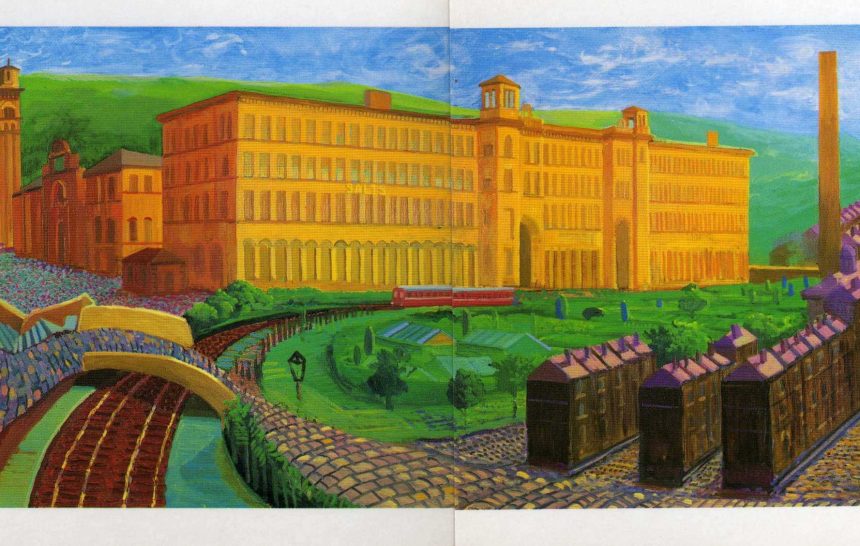
This is a picture of the Salts Mill painted by David Hockney and exhibited at the Mill.

Salts Mill it is a beautiful building and I quote from their official page: ‘The Mill opened in 1853, the centerpiece of Sir Titus Salt’s utopian vision of Saltaire. He built the adjoining model village to house his workers. Cloth production at Salts finally ceased in 1986, and the following year the mill was purchased by the late Jonathan Silver, who re-imagined it as a place where culture and commerce could thrive together.’

On that note Salts Mill hosts a very substantial number David Hockney’s  permanent art collection, special events, and exhibitions, there are  lovely restaurants ( I  can vow for that, I arrived early and I went for a delicious salad  for lunch  before my visit), shops to browse all sort of goods, from books to clothes and home ware to art supplies and everything in between….


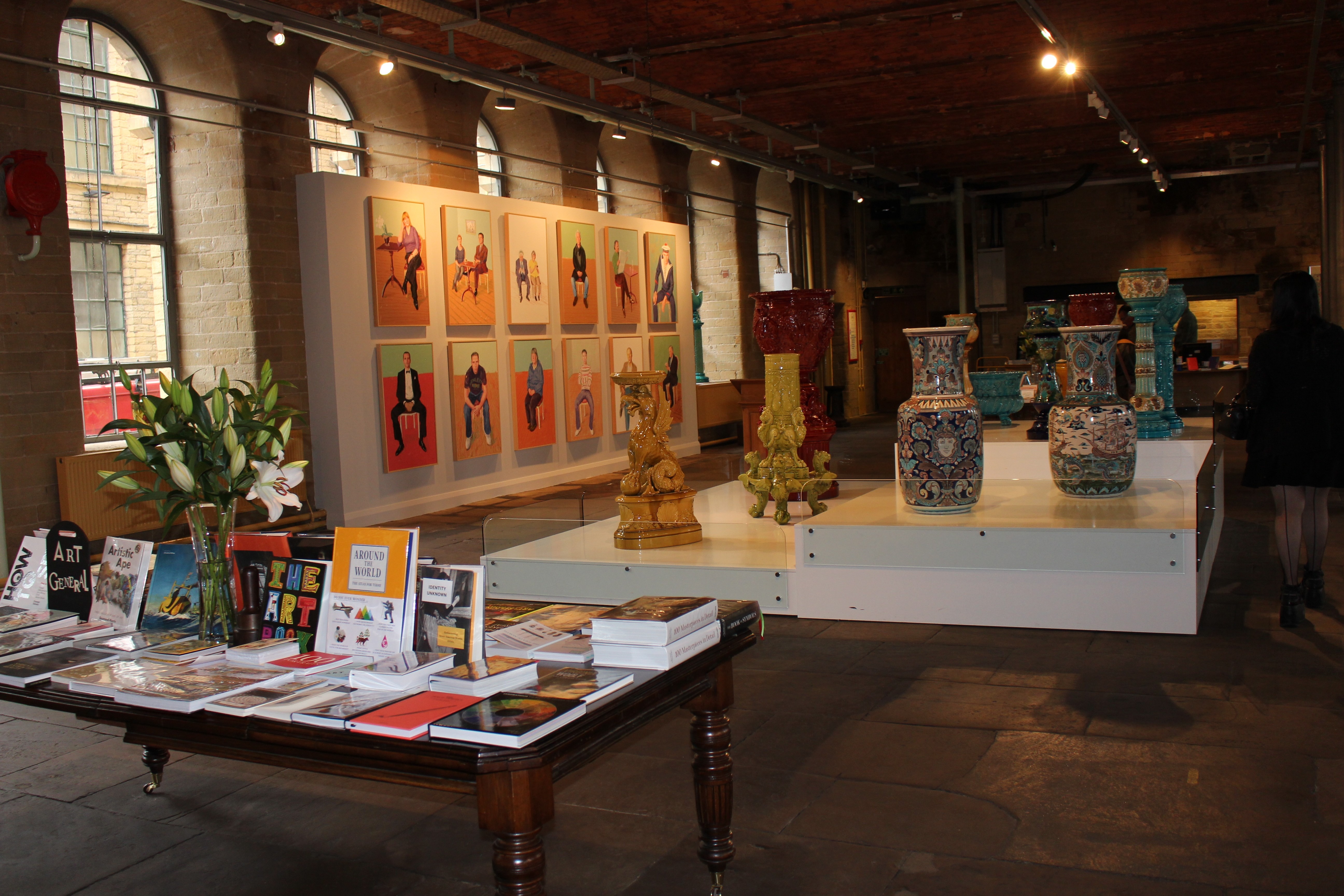
You know how much I love art and exhibitions in general, I also love guided tours too, the lady that took us around the Mill was called Sue  @saltsmill and she was a FANTASTIC ambassador for the Mill!

She was not only incredibly knowledgeable on David Hockney’s art work and life, but also Sue was genuinely so enthusiastic about his work that it was contagious. I loved every single minute of it! thank you, Sue!

I saw exhibits of Hockney’s work before in London but I thought the Mill was the best overall experience.  So if you got a chance and you are in the area go and have a look, it is well worth it a visit!

Now why I like Hockney and why I think it is relevant for my yarn endeavors?

Bare in mind that I am definitely not an art critic and I look at paintings just  as the average person’s perspective.  I like  mainly two things: his work is innovative, he uses not only canvases and paint or pencils but, printing, lithography, fax machines, photographs, iPad’s print outs  and an 18-screen film installation;

this is one of his huge paintings:  It is called “The Arrival of Spring in Woldgate, East Yorkshire in 2011 (twenty-eleven)”  it was part of an exhibition at the Royal Academy of Arts in London January 16, 2012. (Routers)

He also paints lots of landscapes and portraits,  this one it is of his parents:

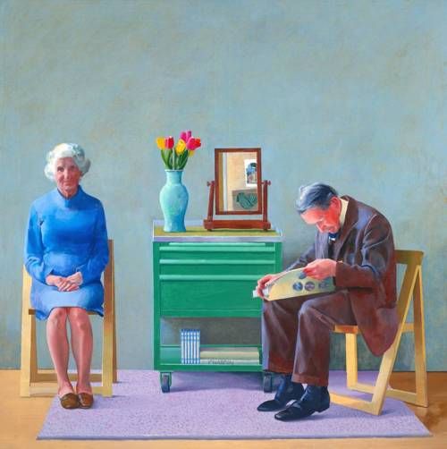
My Parents, 1977. © David Hockney/Collection Tate, London

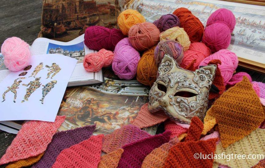
and the second thing I like which is my favorite thing and has given me much inspiration is that his work is VERY COLOURFUL! :


So I came back with a head full of colors, and a bag-full of postcards to use a reference!

So get a pair of sunglasses and be prepared for a shower of COLOURS in the next blankets!!

happy crocheting,

Lucia xxx


JULY IS NEARLY OVER…THE HARLEQUIN BLANKET’S DETAILS

Hello everyone,

This month I am very ahead of myself! It has been a really busy month, I had a lot of deadlines and also I went to the Blogstar’s summer meeting last weekend which was absolutely fantastic! I came back with a bag full of new yarns and shades!! I met several of Stylecraft’s retailers too which was very interesting but I will tell you all about in another entry because the purpose of this one is to give you the details of the ‘Harlequin’. Having said that, I have been messing around in my studio all week clearing up yarn and upgrading the space, those of you that follow me on facebook will have seen some of the pictures…the purpose of the clear up was to be able to play with all that squishy, colorful new yarn!

I can’t wait to show you some of the new shades !!!!

I will update the blog and the Facebook once I start to make some samples and decide what to do with the haul….I am also going camping next week just for five days near Gloucester, with my daughter Francesca, and my friend Yvonne, another fabulous crocheter, so guess what get put in the boot of the car before anything else:

I bet you already know… YARN, YARN, YARN !!!!!

But as usual, I m going on a tangent… back to the ‘HARLEQUIN’:

I haven’t had a chance block the blanket yet as you can see the weather is really poor and I had no chance to do it properly as I  can’t dry it outside, so apologies if the border looks a bit “curly” it is actually perfectly flat.


first the PATTERN:

As said on facebook it is not mine but I found it free on the internet. It is the work of Solveig Grimstad , a very talented  Norwegian crocheter. This is her page :https://www.facebook.com/Solstrikke/.

She has fabulous projects, some are translated in English too, there are charts ( I followed the chart for my Harlequin)   and this is the link to the harlequin blanket which I used for my version:

http://www.ravelry.com/patterns/library/harlequin-blanket-5

I followed her pattern and my blanket measures: 92 cm x 102cm including the border. ( the original one is 75 x 80 cm.) I think the discrepancy between sizes is due to the yarn used, and the fact that  I made a different border.

As in the original version, there are:

38 full diamonds motifs,8 half diamonds

8 half diamonds  (vertical),

12 half diamonds ( horizontal).

The joining method is a JAYGO and again she has a lovely very clear photo tutorial on her blog’s entry I  gave you the link to, which I have followed.


BORDER:

I wanted a border a little bit more substantial so I opted for a different one:

Many of you I am sure are aware of the fabulous CAL called: NUTS ABOUT SQUARES. sponsored by Scheepjes. http://www.scheepjes.com/en/

It is free on Ravelry: http://www.ravelry.com/patterns/library/nuts-about-squares-cal  and also comes with Esther Dijkstra ‘s fantastic video tutorials too!!!

Nuts about Squares CAL


I really wanted to make the Nuts about squares blanket but sadly I have not enough time to squeeze another project in! I have still followed the different squares’ entries online as many of my favorite designers have participated designing one of the squares.

The border I used is week 15 of the CAL ,  it has been designed by Tatiana Kupryjanchyk    here is the link:

http://www.lillabjorncrochet.com/2017/07/nuts-about-squares-cal-border.html

the only thing I have added is a row of trebles all around to adjust the number of stitches to the requirement of Tatiana’s pattern repeat.

and a final row of: 1dc,3ch,1dc on he same dc of the precedent row, skip one dc and repeat. It is my mini shell finishing that I use in most of my blankets.

The joining color is CREAM  ( 2 balls)


crochet hook: 3,5 ( normally I use a 4,0 for the Stylecraft’s dk but I wanted a more tight fabric hence the 3,5. please do a swatch if you want to crochet the blanket and see what you like best).

YARN USED:  STYLECRAFT SPECIAL DK

STYLECRAFT SPECIAL DK in:

GOLD/GRAPE/VINTAGE PEACH/SPICE/FONDANT/CANDYFLOSS/BUTTERMILK/CREAM;

FONDANT/CANDYFLOSS/BUTTERMILK/CREAM;

STYLECRAFT  LIFE DK in:

DAFFODIL/MELON/CLOVER/LILY/FUCHSIA;

BATIK:

CORAL.

with the option of one ball of  KING COLE  SPRITE shade KOS.

I said option because you really don’t need it as there is plenty of yarn left from the Stylecraft to finish the project.


The reason I used the Sprite is that I wanted to create the effect of the crumbling walls of many of Venice’s buildings and the variegated effects of the Sprite did the job.

Here is a picture that let you understand what I mean with crumbling walls if you never visited Venice in person…they have a wonderful color/texture. the image is the House of the Rennaissance painter Tintoretto :

I love the colors not only of his house but of his paintings too. Look at this is called “Christ in the house of Mary and Martha” painted in 1580.

The warm oranges gold and pink are very common in the Rennaissance art, especially when linked to Venice.  I got another painting for you: this is a portrait of the Doge Andrea Gritti ( the Dogi were the rulers of Venice )  painted by Titian in 1545.  Just magnificent!


Anyway back to the Sprite …I got my ball as a sample from Linda at Threads…( she always tempts me with something new to try!!)  Now the Sprite looks lovely but I haven’t tested it.  I am saying this because I noticed it has an ever so slightly fuzz that I am not so sure how it will behave after several washes and use. I am very thorough with my testing, especially if I am going to recommend a yarn to you I feel the responsibility to make sure it behaves as it should as there is nothing more disappointing than spending loads of hours on a project and then ruining it through washing or use.

All the blankets I make are not just made to be PRETTY they are also made to be USEFUL, dragged by children, family pets, back of your sofa, car, taken on family holidays,  or simply used when you want something comfortable to wrap yourself in.

every yarn I use, regardless of the brand,  goes under the same process: I make a sample and then I hand wash it first to see the color fastness, then I put it in the washing machine and tumble dryer several times before using it for my projects. I didn’t have time to do all the above for the Sprite, so fingers crossed.

QUANTITY:

the blanket weight just 560 grams. I used probably about 45 grams of each colour…some more some less, plus 150 grams of cream again the quantities are approximate. But , as I said before, you can really decide if you want more motifs in one color instead than the other. I did about 3 motifs for each color to distribute the hues  evenly.


So this is all for today, I leave you with a picture of oranges and pinks in my garden…have a wonderful weekend and thank you for reading,

Lucia xxx


Odinella..the Icelandic Blanket.

Another blog entry…two in two days!  I love weekends because no work mean more time to write stories!  So some more about the June blanket:


Despite the heat, I finished the June blanket just a few days later then envisage.


I was so close to put the blanket in the WIP’s pile …as I didn’t consider the possibility that Scotland could get hot too, but I loved the yarn and the pattern I designed for the blanket so much that I persevered regardless of the temperature.

So now it still needs a  very simple border of some sort of type but I have run out of yarn and while I am waiting for it I started my July new adventure.

I might postpone the border to September I see how things go.

I was on the Ayrshire coast last weekend with my daughter Olympia and three of her friends,  so I took a few pictures of the blanket and the lovely coast.

The blanket is beautiful both sides! I still cant make up my mind which one I like the best…


The original idea for the pattern was to emulate the colors of Bifröst, the burning rainbow bridge that reaches between Asgard and Midgard,  a tribute to yet another of the books I love and I mentioned before: ‘the Prose Edda’.

I thought I was going to make some sort of stepping stones like large pebbles, colorful paving stones for the bridge, but as always happens with things that are made as you go, the ‘pebbles ‘ looked more like a starfish then anything else!

more so when I photographed the blanket on the Beach…

So yeah…no paving stones, sorry Heimdallr,


On the matters of lore, traditions, and stories I was going to mention elves and trolls and more so some really amusing little books written by a blogger and journalist called Alda Sigmundsdóttir. She has written several “Little Book” . they are a series of short essays that tell the story of the Icelanders,  now and in the past, some of the how they live, how they eat, how they deal with the beautiful but challenging Icelandic landscape.

Some of the topics include early superstitions, cultural anecdotes, and stories of the elves. (Do modern Icelanders really believe in elves? The answer may surprise you!)

Back to the blanket. I gave it a new name is called Odinella. you will find out why …

I realized that looks more like a  coterie of starfish, but as they are technically not fish… I am calling them sea stars.

While looking at images of sea star to use for this blog entry I stumbled on this beauty…is called Odinella and belongs to the family of the Brisingids.


The sea star’s family  is named after the Brisingamen, Old Norse for “glowing jewellery”,  ‘fire torc’ , the most beautiful necklace worn by the goddess Freyja so we still have  after all a Norse mythology connection, and Heimdallr is back too, as in the Prose of Edda, Loki steals the necklace, to avoid been found  he disguises  himself into a seal. Heimdallr turns into a seal as well and fights Loki. Heimdallr wins and returns Brísingamen to Freyja….great fun indeed.

Now this might be a bit controversial, as the Prose of Edda is a phenomenal extraordinary scholarly book, but…if you have no time to read it or you want something ‘lighter’ to share with your children you should have a look at  Neil Gaiman’s book :’Norse Mythology’. I found it witty and very enjoyable,  for me the added bonus,  is that it is available on Audible too, and the reader is Neil Gaiman himself!

back to the blankets some lovely shots of Turnberry’s lighthouse…( I walked over the golf course, not with a set of clubs but with a basket, a blanket, and a camera..and few puzzled looks)


the details of the pattern are still in a jumble in my scrapbook. I will ( don’t I always say that?! …) write it  down, but ,as I have been asked for the yarn I used, here is the list of the colors:

The yarn is LETT-LOPI  , a DK weight  100% wool. it comes on a 50 grams ball,100metres.

0867/9427/9426/9423/9421/1404/9418/9419/9432

/1414/9417/9431/9429/9428/9414/9434/1408.

I used 2 balls of all the above, besides 1408 (light red heather)  which I used just 1 ball as it is a very powerful hue.


the joining was done with 6 ( so far ) balls of 0058 (dark gray heather) I  am saying so far because I haven’t finished the border yet. I reckon I will need probably another 4..I am not sure.

More warnings…they yarn is FABULOUS BUT….if you are accustomed to the feel of acrylic, cotton, or merino please note that this is different. Lopi Lettlopi Wool is a breathable and water-repellent Aran weight roving yarn.

I love it and it is my favorite 100% wool yarn! it is the best for garments for the Scottish weather as it is rustic but so warm you will be pleasantly surprised! also, it is handwash only.

my advice? if you want to make the blanket before embarking in buying the full amount yarn just try a ball and see how you feel about it…

that is all for today,

happy crocheting,

lucia xxx


July’s blanket: A white rabbit, Venice,brocade and Arlecchino…..

July is already here!!! and to quote a very special white rabbit from one of my favorite books, ‘Alice in Wonderland’:

“the hurrier a go the behinder I get”!!


Besides me  chasing my tail for the past few weeks trying to fit everything in , Alice in wonderland’s  little white rabbit is not just going to remind me that I seem to be always behind with things, his tabard with the playing cards, is also going to be one of the sources of inspiration for my July blanket.

The July blanket is also a place that is very dear to me and where I have lived for 7 years while studying Architecture…

VENICE !

I know, how lucky is that?? I loved every single minute of those 7 years!


There are so many things I love  about Venice, to fill several blog entries, but for today I m going to focus on colors…( just for a change!) I am going to show you what has inspired not only the palette for  July’s blanket but also the pattern too.

So where to start….some shots of fabrics, buildings, interiors…  a riot of warm colors that summarize Venice for me…

how about the ‘coral room’ at Palazzo Brandolini,


or the interiors with their brocade’s dressed columns of St Brigida Church…


Some amazing fabrics…  Rubelli’s ‘ silk brocade with strawberries’

When coming to fabrics Venice for me is Rubelli and Mariano Fortuny….

From the historic Venice location of Palazzo Corner Spinelli , Rubelli , a 200 year old textile company, produces in their own weaving mills, an extraordinary quality of damask, silk, two-pile velvet, soprarizzo, lampas, and brocade.  they also have very modern and contemporary designs but what I am focusing on, is their traditional cloths.


and with Rubelli I also have to mention Mariano Fortuny.

Fortuny was a talented artist with a  passion for textiles.

He was an extraordinary man,  an inventor, painter,  sculptor, photographer, he was interested in architecture, and theater staging and lighting. But most of all  Fortuny was a fashion designer and  Palazzo Fortuny is the place where this extraordinary eclectic artist lived and worked and it is now a Museum well worth a visit.

Fortuny ‘s dresses were so legendary that if you like Proust you will remember Albertine been bribed to stay  by buying her Fortuny gowns that “swarmed with Arabic ornaments, like the Venetian palaces hidden like sultanas behind a screen of pierced stone.”


When it came to fabrics and fashion, he not only created extraordinary garments but he also manufactured his own dyes and pigments for his fabrics, with these dyes he began printing on velvets and silks and dyed them using a press that he invented with wooden blocks that he engraved the pattern onto. His dresses are seen as fine works of art today and many survive, in museums and many people’s personal collections.


Well, what can I say?, every corner of Venice is truly remarkable

to go back to the blanket now can you see where the colors come from….and the shape of the pattern?

the shape of the pattern is  not only from the playing cards’ tabard of the white rabbit , it is also from  the outfit of a very famous character of ‘la Commedia dell’Arte’ : Arlecchino ( Harlequin)


here a bit more of ‘Venice’…


Guess is enough for today, I m going and see how I assemble this little blanket of mine….

happy crocheting  !

Lucia xxx


X